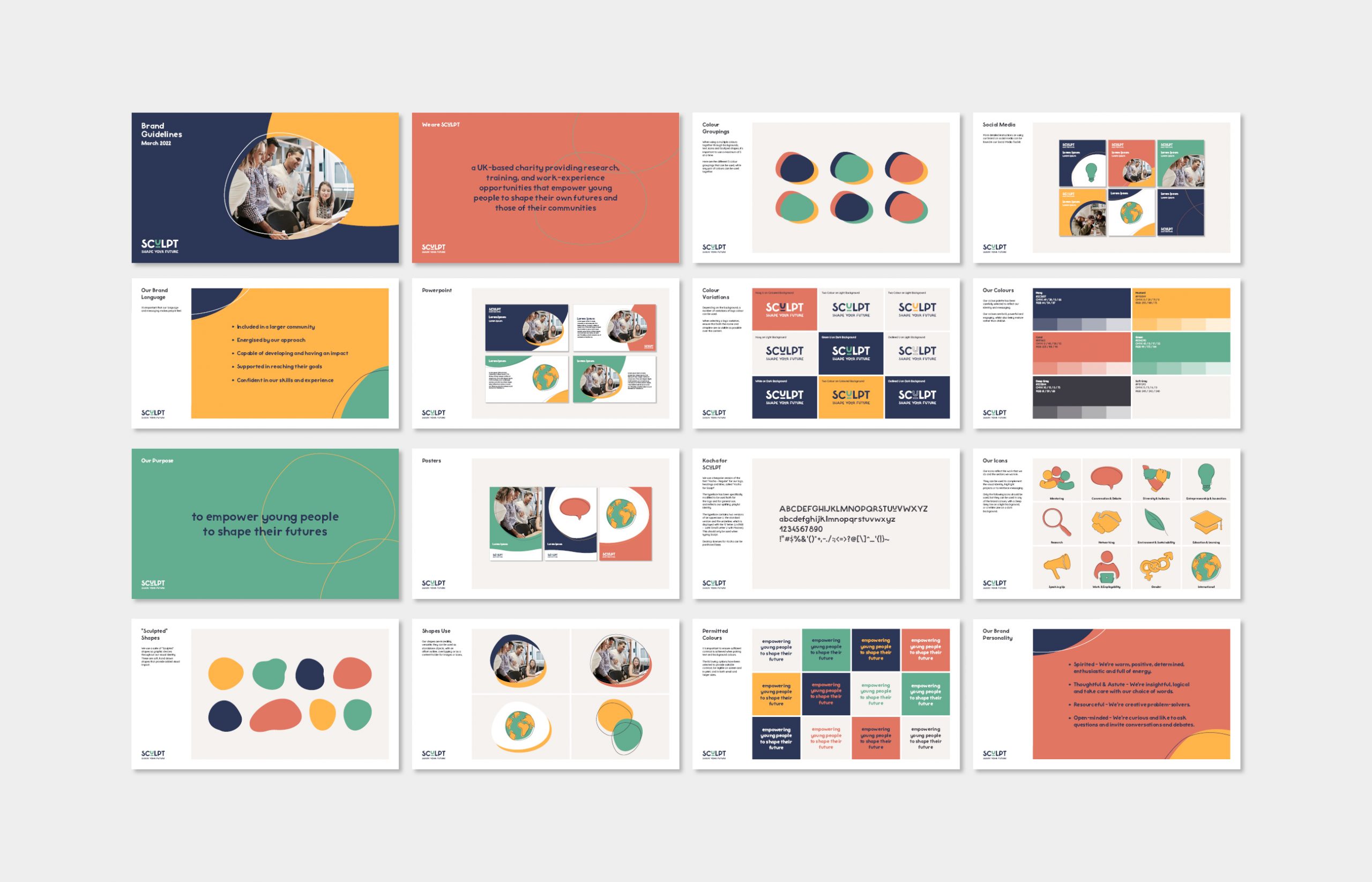
Project in brief

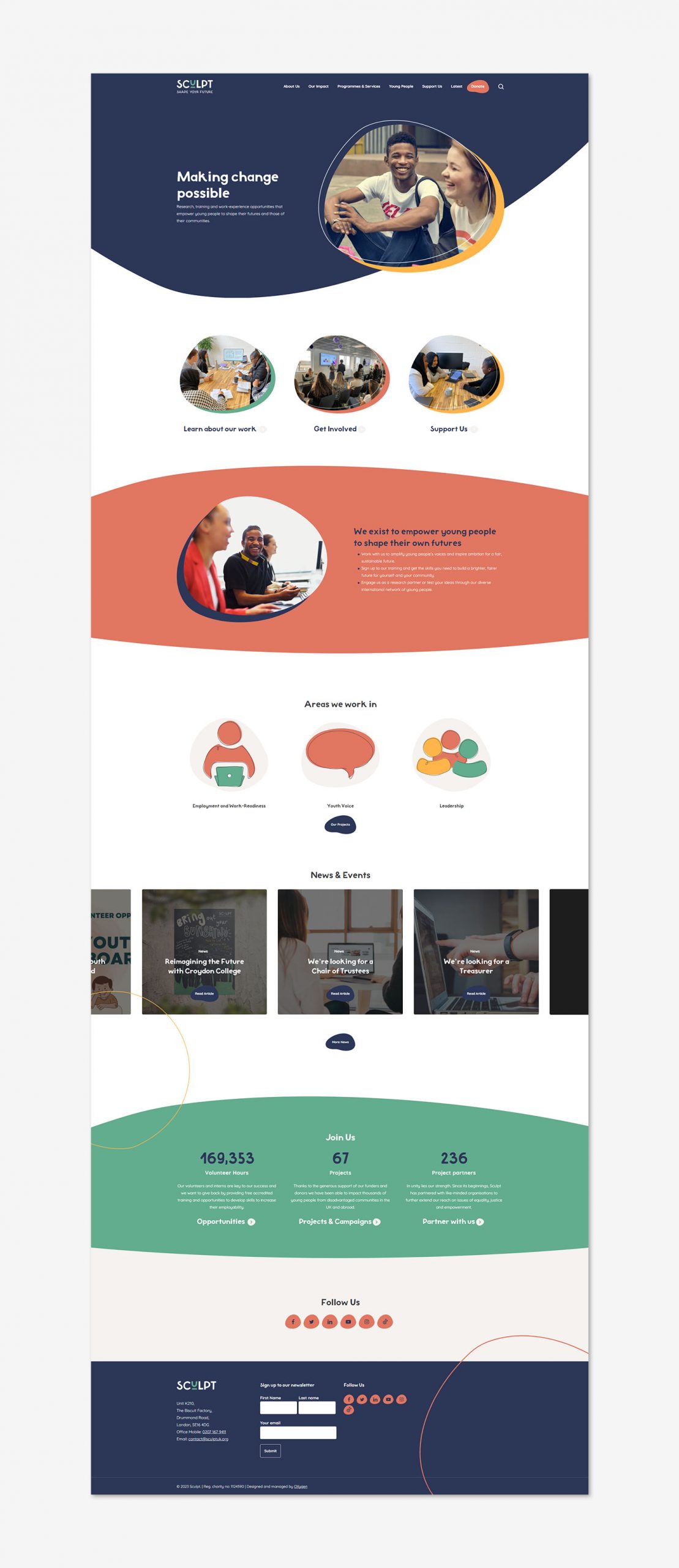
Sculpt (previously IARS International Institute), is a UK-based charity providing research, training and work-experience opportunities that empower young people to shape their own futures and those of their communities. They work directly with young people, employers and professionals who support young people. All their work is guided by young people themselves and based on carefully researched evidence. Sculpt came to OXygen as IARS, who felt their name and brand identity failed to accurately reflect the charities vision, mission or end users. IARS sought a new name and identity that put young people front and centre, showcasing the solutions offered for young people to help them feel positive about their futures.

What we did

  • Visual Identity
  • Brand Guidelines
  • Tone of Voice
  • Website Design & Development
  • UI/UX
Sculpt Brand Guidelines

New Directions

Sculpt came to OXygen as IARS, who felt their name and brand identity failed to accurately reflect the charities vision, mission or end users. IARS sought a new name and identity that put young people front and centre, showcasing the solutions offered for young people to help them feel positive about their futures. In order to fully understand the needs and ambitions of the organisation and their key stakeholders, we worked closely with Oxford HR’s Organisational Effectiveness team, holding a live session to work with the Board and IARS employees to help them understand their core developmental process; utilising a dynamic process to construct identity and messaging, as a part of their journey to how they now want to portray themselves.

Working with OXygen was an extremely enjoyable and productive experience. The team took the time to understand our needs and utilised a wide range of skills to get us the result we needed - from organisational development and tone of voice to great design and technical ability.

Dr Claire BonhamCEO - Sculpt
Sculpted Icons

The Sculpt logo and visual identity takes cues from the name and strapline, focusing on carefully crafted, Sculpted shapes. Our team modified an existing font to create a bespoke typeface for Sculpt, used in both the logo and throughout the brand. The logo features a highlighted and underlined U, which demonstrates how Sculpt empowers you, young people, to shape their future and that of their community. We developed a set of hand-drawn icons to reflect the sectors Sculpt works in, to highlight specific projects and to reinforce messaging. All of this is paired with a bright, bold colour palette and uplifting imagery, ensuring the new brand is engaging, dynamic yet professional.

Sculpt website homepage mockup

Reimagining Sculpt’s digital presence

The OXygen team reimagined the charity’s website to shift the focus onto young people, defining the copy to reinforce the new messaging and refined purpose. We simplified the navigation of the website to improve the user journey and experience, and stripped back excess content to focus on the core message.

The end result is a totally reimagined visual identity, with the same fundamental values at heart. The Sculpt brand, through careful, research-based thought, now aligns more with the intended audience and will provide an important hub for young people and their communities going forwards.

View the Sculpt website
Sculpt website mockup
95
Homepage Lighthouse Performance Score
56
Cleaner than average websites
92
SEO performance

Communicating Impact

OXygen have also designed flyers, newsletters and an impact report for Sculpt, helping to quantify the charity’s reach to donors, funders and partners.

Mockup of Sculpt Impact report

OXygen were extremely responsive to our questions and ideas and we are delighted with the end result. We would recommend working with OXygen to anyone looking to update their visual identity and brand.

Dr Claire BonhamCEO - Sculpt